OLIVE OIL - LOGO BRANDING & PACKAGING DESIGN
Logo, Identity and packaging design developed for a Greek olive oil brand. © Delatour Design Paris / Oli tina.
Service
Logo design, identity, branding, brand design, food packaging design
Client
Oli TIna

OLI TINA
OLIVE OIL
Oli Tina, love in an oil container.
When it comes to olive oil, one rarely knows which to choose... Spanish, Italian, Portuguese?
Of course everyone will tell you that it must be extra virgin first cold pressed olives, but even fallowing that advice you will stumble quite regularly on a very sour, with a nice sell but lacking of flavor truly disappointing product.
It’s not often that at Delatour Design Studio we can brag about developing a brand, logo or packaging for the best possible product on the market. Well this times we did, all three of them, and we now can say with certainty that the best olive oil in the world is Greek ! And not from anywhere in Greece, but from the Cythera island (Kythira in Greek). It is said to be the cradle of the Goddess Aphrodite lying opposite the south-eastern tip of the Peloponnese peninsula. The island is strategically located between the Greek mainland and Crete, and from ancient times until the mid 19th century was a crossroads of merchants, sailors, and conquerors. As such, it has had a long and varied history and has been influenced by many civilizations and cultures. And on this island is bred a very specific variety of olive, the Koroneiki, emblem of Greece from where it is originated, and known for its high concentration of phenolic compounds.
Our client Olivier Mourin bought this olive grove from an Orthodox priest, who planted pluricentenary olive trees, 80 years ago. This French entrepreneur who got successful in the low cost new automobiles business and gastronomy concepts entrusted us with the creation of the logo, branding and packaging (a metal container) for his beloved Oli Tina oil, a product brand named after his wife.
An almost Holy name you will agree.
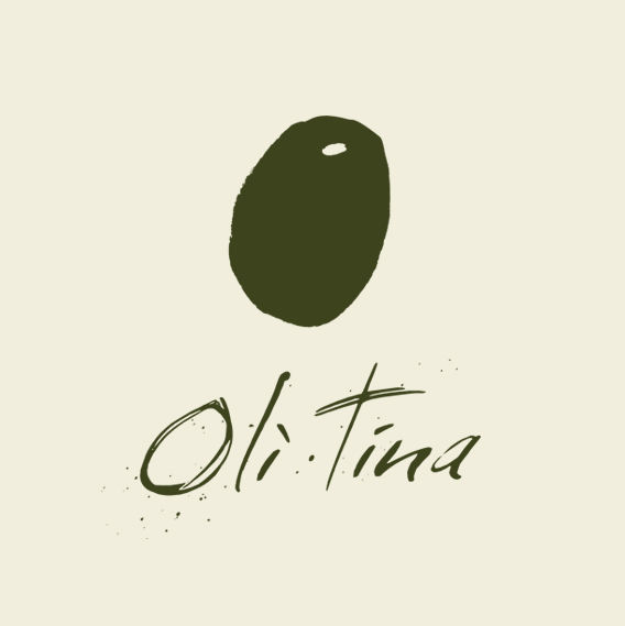
We developed a very sensitive image, with a logo design and font almost like a hand drawn sketch, signed underneath by the artist. Subtle shades of green and gold on the packaging, nothing too modern, nothing too classic. An obvious name and logo for a simple product. But believe me, from the simplest things can come the greatest surprises.
Jimmy Delatour, founder of Delatour Design studio.
https://www.facebook.com/oli.tina.evoo/


